Process
Processes, techniques and materials used in my work

Processes, techniques and materials used in my work
I am a visual artist born in the foothills of the Acropolis in Athens, a vibrant gathering place of philosophers and artists for thousands of years. I am deeply passionate about the myths and archetypes of my cultural heritage and return repeatedly to sacred archaeological sites to explore themes of metamorphosis, fragility, and impermanence.
For me, materials are never incidental. Concept comes first; the search for the material or process that can carry it, rather than merely illustrate it, follows. That search has led me across photographic, printmaking, papermaking, and bookmaking traditions, each material chosen because it can enact a particular idea rather than merely depict it. Each essay that follows traces one such material or process: its history, its craft, and the collaborators who helped bring it into the work.
Linear B is a syllabic script used to write Mycenaean Greek, predating the Greek alphabet by centuries. The earliest known examples date to around 1400 BC, surviving mainly in palace administrative records: inventories, accounts, and offerings inscribed on clay tablets. The script, comprising 87 syllabic signs and roughly 150 ideograms, was deciphered in the early 1950s by Michael Ventris, whose work identified the language as Greek, the earliest attested form of it known to survive.
Among the thousands of surviving tablets, only two mention a-ne-mo-i-je-re-ja, "the priestess of the winds." I first encountered her name in Eleni Ladia's 2013 study of daemons in Greek antiquity. The reference stayed with me. Ten years later, while working on the artist's book that would bear her name, I traveled to Crete to see one of the tablets at the Heraklion Archaeological Museum, with the permission of Dr. Georgia Flouda, Head of the Department of Prehistoric and Minoan Antiquities.
What began as research was also a more private, metaphysical yearning: to reach this almost unknowable woman across time and address her through the language in which her name had survived. I wanted to carry a contemporary Greek text backward into Linear B.
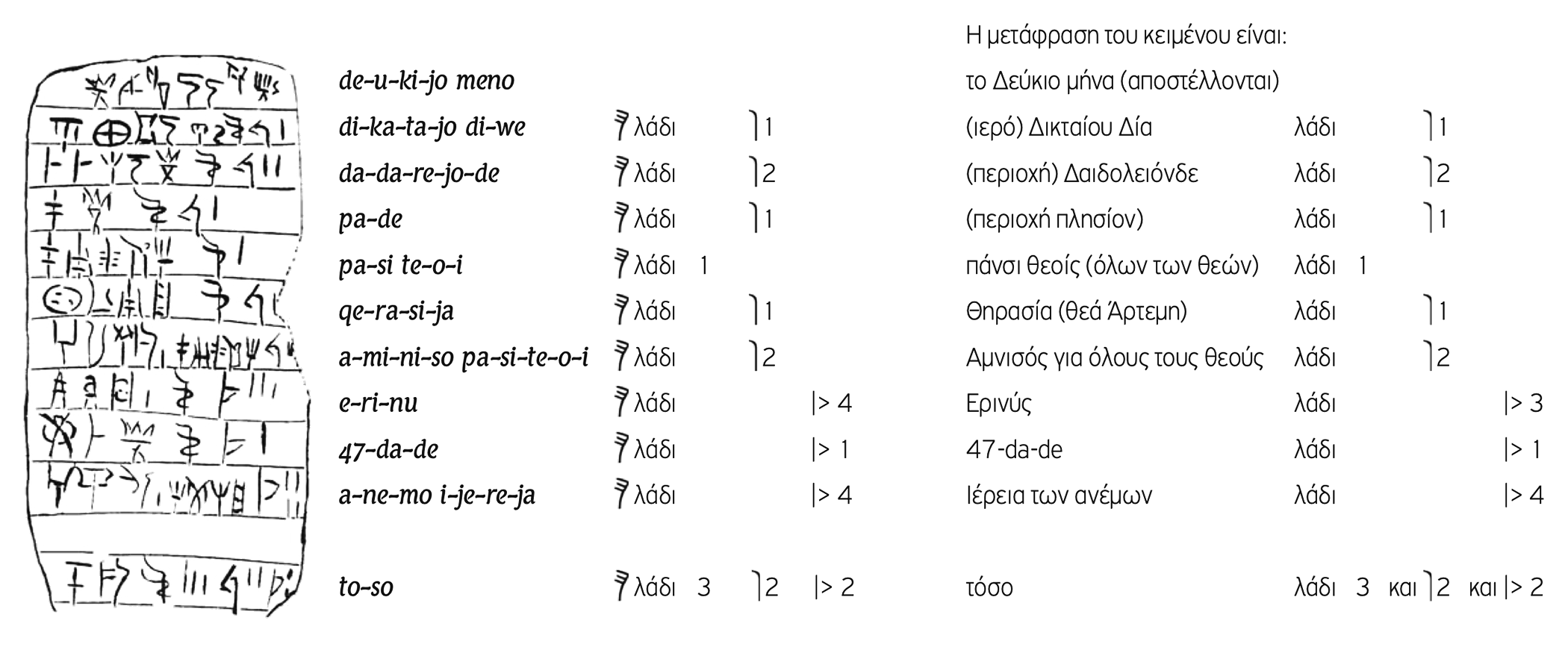
I began studying the script weeks before traveling to Crete, using books and two digital tools Dr. Anna Judson recommended, Learn Linear B and a Memrise course, one developed with her direct consultation. I continued on the boat to Heraklion, moving between the apps, Chadwick's account of the decipherment, and the syllabary itself. What I had imagined as transliteration proved to be something much less direct. Linear B is not another alphabet to exchange letter for letter, but a syllabic system with its own orthographic conventions, omissions, and exceptions. I abandoned the idea of transliterating the text alone.
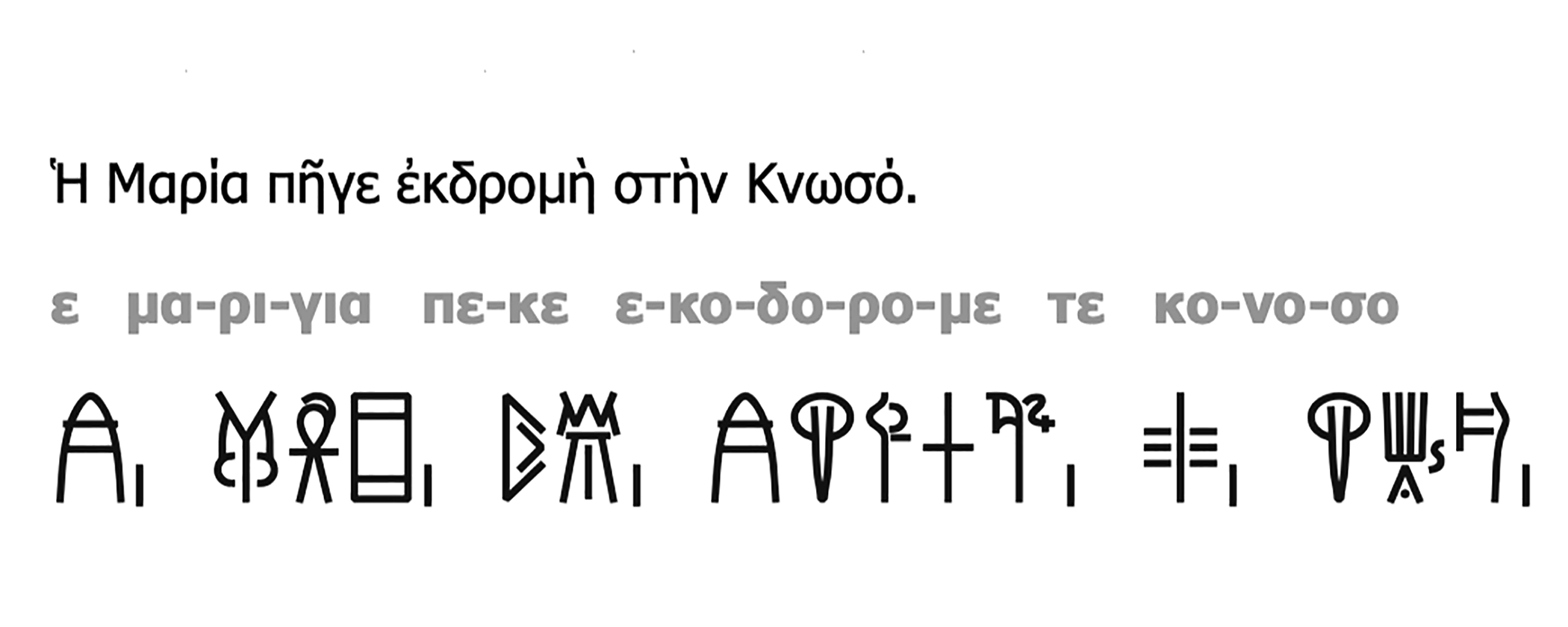
The method that followed had two stages: breaking each line down by sound rather than spelling, then matching those units to syllabograms checked against Linear B lexical and orthographic sources, working directly from the modern Greek rather than through the Latin transliteration convention used in Linear B scholarship. A single sentence, worked through below, shows the method in practice. Where a contemporary, poetic text exceeded the surviving corpus of palace records, I worked from established values rather than inventing signs. I corresponded with Dr. Judson, who directed me toward studies of Mycenaean spelling that clarified both the possibilities and limits of the tools I was using.
Accuracy mattered precisely because the book would remain largely illegible. The obscurity was intentional, part of the distance I was trying to cross, but illegibility could not become permission for invention. I wanted the language beneath the signs to remain accountable to what is known of Linear B and how it recorded Greek.
One of the two tablets naming the priestess, KN Fp 1+31, records an offering of oil made to her at Amnisos, the archive of it reproduced below. I traveled there as well, to rock, wind, and the sea below, the physical place named on a clay tablet three thousand years ago.
The written text remains intentionally illegible, its syllabograms silent. A companion sound poem approaches it through another sense: I intone the letter to the priestess in Greek, English, and Linear B, the three languages braided together in a soundscape created by Heather Perkins from voice, wind, and waves recalling Amnisos.
Lapis Lazuli, one of the world's most prized semi-precious gemstones and a prized pigment in art and religious iconography, has been mined for over 7,000 years in the Sar-e-Sang deposits of the Kotcha Valley, Afghanistan. This region is renowned for producing the highest quality Lapis, a deep blue stone that was once more valuable than gold. Throughout antiquity, Lapis Lazuli was exported to distant lands, including Mesopotamia, Egypt, Greece.
In the Minoan frescoes at the Knossos palace in Crete, blue is a dominant color. Vibrant scenes showcase the significance of this color in Minoan art. Blue dolphins leap above the waves; elegant 'Ladies in Blue' are adorned and adorning; a blue bird is perched on a rock; a blue boy gathers saffron. While most of these frescoes utilized Egyptian blue—a pigment made from silicon, copper oxide, and calcium oxide—Lapis Lazuli was also employed, particularly in the sarcophagus of Agia Triadha. This connection to ancient art informed my decision to use Lapis Lazuli for a bespoke ink.
To print the Linear B text of my artist book "a-ne-mo-i-je-re-ja," I knew that a deep blue ink would be essential. Rather than relying on commercial, chemical-based inks, I sought something more authentic and historically grounded. To achieve this, I collaborated with Alex Warren of Sinopia Pigments to source 80 grams of the finest Lapis Lazuli from Afghanistan. The pigment was extracted using the Fra Angelico Method, a meticulous and labor-intensive process. This method involves grinding the Lapis Lazuli into a fine powder, mixing it with wax, pine resin, and linseed oil, and then kneading it in a lye solution to separate the purest ultramarine particles. The result was a pigment of unparalleled beauty, deeply connected to historical practices.
My printer, Thomas Wojak, then mixed the pigment with a transparent screen-printing medium. The result was a custom ink that not only honored the historical significance of Lapis Lazuli but also captured the deep, enduring blue of the Minoan frescoes of Knossos.
Watermarks are created by attaching a form (text, graphic, symbol or pattern) directly onto the screen of the paper-making mould. This results in an image that is visibly lighter or more transparent than the surrounding paper.
For the book of whispers, I designed 24 individual watermarks, using the GFS Ignacio font, a delicate almost calligraphic font. The digital files were used to make negative films for each of the 13 folios of text and graphics.
Berlin-based papermaker Gangolf Ulbricht used a 100-year-old English mahogany mould to create the watermarks. The screen of the mould was coated with light-sensitive material in the darkroom. For each folio he exposed the screen with an overlaid negative film to ultraviolet light. The result was a matrix of hardened text or graphic; the surrounding material was carefully washed off. This matrix was used for making the required number of individual watermarked folios for the edition. Once this number was reached, the matrix was destroyed and a new one was created for the next watermarked folio.
The paper pulp was bleached flax, the same primary material used to make the linen garments of ancient Greeks.

I have a true passion for rare, handmade papers which I consider an integral part of the aesthetic and emotional interpretation of my images. My favorite paper is made from the fibers of the Gampi bush. This plant produces paper that is translucent, with superlative beauty and a smooth surface that glows. It is fragile, yet incredibly strong. I feel as if this paper has its own live energy. When I am working with Gampi, it demands my total, uninterrupted concentration throughout all stages of the Platinotype process, in order to bring the vision of my images to life.
Unlike Kozo and Mitsumata, the plants used for most Japanese paper, Gampi cannot be cultivated. It grows in the wild, in the mild, mountainous regions of Japan. Harvesting stalks takes place between February and March, when they are fully hydrated; it is then easy to remove the bark without traumatizing it. The innermost white layer of the bark is used for making Gampi, after the external black layer and the middle green layer have been stripped away. The clean white strands of Gampi are bundled together and placed to dry in a cool, shady place.
For the next stage of papermaking, these strands are placed in a large tub where they are cooked for three to four hours until very soft. Chirotiri (removing of the dark spots) follows. It is a labor intensive and time-consuming process. A small amount of the cooked fiber is put into a bamboo basket floating in water and then any scar tissue, dark spots or unevenly cooked parts are removed by hand.
The Gampi fibers are then beaten on a stone using a wooden mallet. This is done so that the fibers are separated and hydrated to create smooth and homogeneous sheets of paper.
Sheet formation involves mixing water with Gampi pulp and Neri, a type of natural glue. Using a bamboo screen and a wood frame, the mixture is moved back and forth, and side to side across the mould to form the sheet. The fiber settles on the screen and the step is repeated again and again until the desired thickness is achieved. The screen with the completed sheet of paper is then removed from the mould and placed on top of other previously made sheets and left overnight to drain naturally.
Later, it is carefully pressed until approximately thirty percent of the moisture is removed. The paper is removed from the stack and placed on drying boards and taken out into the sun. The sun and wind dry and bleach the paper. In the final stage of inspection, dried sheets of Gampi are held up to the light and classified by thickness, color etc. It is now ready for use.
Two of my favorite paper mills include Echizen and Sekishu-banshi.


I use 19th century photographic processes (primarily platinum/palladium printing) to define and express my voice and vision. At the same time, I have a true passion for interdisciplinary work and for combining the beauty and permanence of historic photographic processes, film photography and the power and precision of digital imaging.
For Fragmented Light, after lengthy experimentation I chose a photographic process and identified the right kind of paper that is compatible with the process and aesthetic intent. Finally, I settled on Platinotype and on the rare, translucent, handmade Japanese paper, Gampi. This combination of process and materials became a favorite for most subsequent work.
Platinum printing offers tremendous expressive power and archival value. When done correctly, it yields one-of-a kind prints of an unusual monochromatic beauty, a luxurious range of tones and a unique visual presence. While in traditional black and white fine-art photographs, the image appears to “float” on the surface of the paper, with these alternative processes the image is fused with the fibers of the paper, it becomes an integral part of it. This results in a different visual aesthetic, further enhanced by the lusciousness, and tactile sensuality of traditional and rare fine art papers.
The methodology I follow reflects an eclectic mix of photographic techniques spanning three centuries of photography. The photographs are taken with a medium format camera using black and white film. Image processing and the creation of enlarged negatives rely on the use of digital technologies. I scan the film-based negatives, correct defects, adjust tonality before printing the negatives from digital files.
Platinum printing is labor intensive, chemically complicated, and time consuming. To render the paper photosensitive, I coat it with a precise combination of noble metals (platinum and palladium) in solution. This solution is applied to the paper using a glass rod and a Japanese hake brush. A negative the size of the final print is placed over the photosensitized paper, within a specially constructed contact printing frame. The frame with the paper and the negative are then exposed to ultraviolet light. When the image appears, specific steps are followed to complete the process of developing, clearing, and rinsing. The print dries and the sensitive Japanese paper maintains its internal glow and characteristic texture.
Parchment & Vellum
Chemicals for platinum / palladium printing
Calligraphy
Georgia Angelopoulos
L. Cornellissen & Son
Binding
Ceramic Art & Sculpture
Letterpress printing
Lisa Rappoport
Sandy Tilcock
Joel Benson
Logos Graphics
Screen Printing
Plexiglass enclosures
Architectural Plastics
Michael Gemignani
Composer & Sound Designer
Heather Perkins: WaterDog Studio
Artwork Photography
Filmmaker

